In a previous article, I provided an overview of Dashboards 1.0 in Oracle Planning and Budgeting Cloud Service (PBCS). In this article, I will walkthrough Dashboards 2.0 which is the next iteration of dashboards in Oracle EPM Cloud.
In the Sept 2020 (20.09) release of EPM Cloud, Oracle unveiled the next iteration of their dashboards, Dashboards 2.0. Built upon the powerful Oracle JET platform, Dashboards 2.0 will allow for more modern and advanced visualizations.
The latest version of the dashboards has more options for the visualizations. Below are the examples of the visualizations that can be used in dashboards.
Geo Map Chart Type:
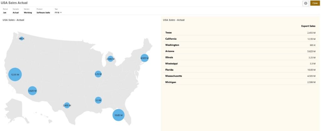
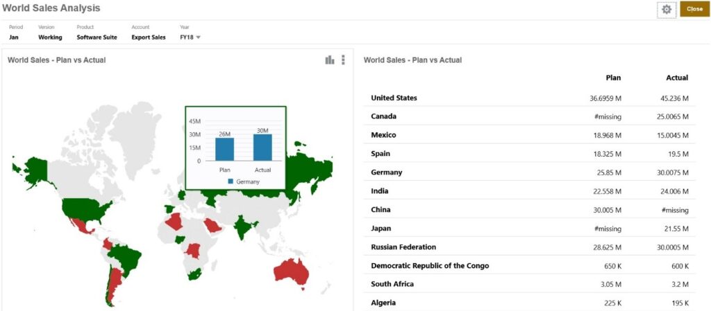
Geomaps are geographical maps with overlays and charts that display some measure about each of the geographical areas that are displayed. Hovering over the bubbles or the color highlight in the Geomap displays a data label.
Example Geomap – USA Sales Using Data Bubbles
Example Geomap – World Sales Using Color Highlight
Pyramid Chart Type
Pyramid chart types use a triangle diagram to represent hierarchies visually. The triangle is divided into sections, illustrating vertically top-down and broad-narrow structures and processes.
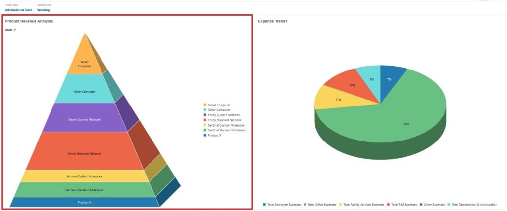
Pyramid Chart Properties:
Legend Position: Choose Left, Right, Top, Bottom, or None.
Value Scale: Especially useful for large numbers, you can scale how a value is displayed. For example, if the value is 1,689,000 and you select K – Thousand as the scaling option, the chart displays the value as 1,689K.
3D Graph: Choose Yes to visualize the data as a 3D chart.
Color: Select Default or click a section of the pyramid chart and choose a custom color for that section.
Waterfall Chart Type
Waterfall charts display a running total of positive and negative values, which is helpful in showing how you arrived at a net value from an initial value.
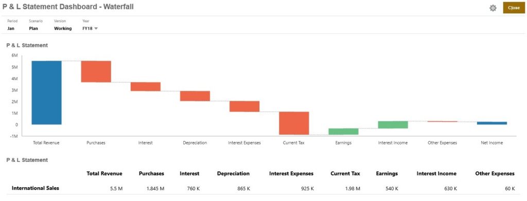
Waterfall charts are used to portray how an initial value is affected by a series of intermediate positive or negative values. Usually, the initial and the final values (end points) are represented by whole columns, while the intermediate values are shown as floating columns that begin based on the value of the previous column. The columns can be color-coded to distinguish between positive and negative values.
Example Waterfall Chart – Inventory Analysis
This example visualizes changes in a single account over time.

Example Waterfall Chart – P & L Statement
This example has expense accounts that are shown as a negative change to Total Revenue, and income accounts that are shown as a positive change, for a final Net Income value.
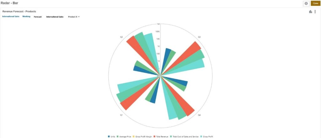
Radar Bar Chart Type
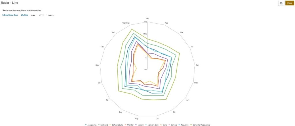
Radar Line Chart Type
Combination Chart Type
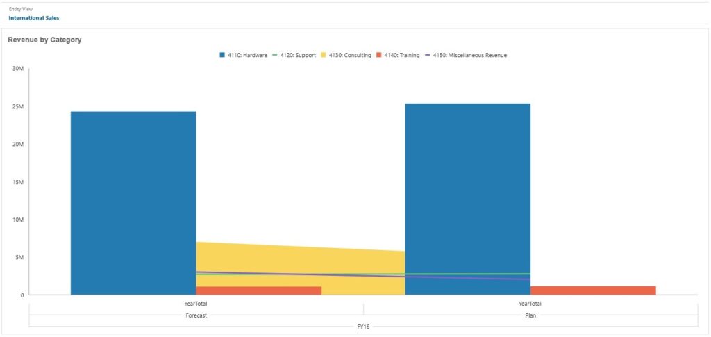
The combination chart is a visualization that lets you merge into one chart any combination of bar, line, and area charts.
You can also add a secondary Y-axis on the opposite side from the primary Y-axis. Adding a secondary Y-axis lets you display the scale for one measure that doesn’t scale appropriately with the other measures on the chart; for example, showing a percentage measure and a currency measure on the same chart.
Area Bar Line Combination Chart
Quick Analysis
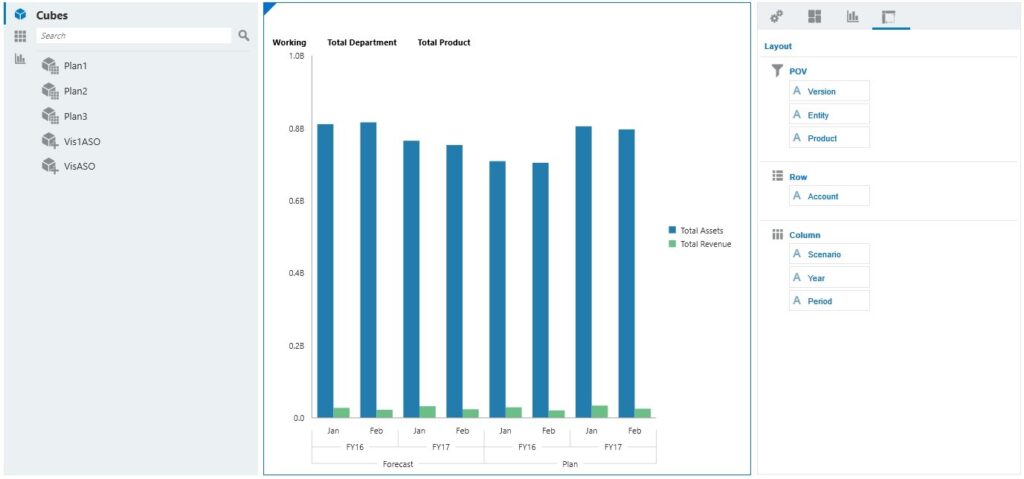
Quick Analysis lets you add components to dashboards without having a prebuilt form. You create an ad hoc query by typing member names in the Search bar or using the Member Selector and then you control the layout of the query in the Layout tab of the Properties panel.
Dashboard Quick Analysis Chart in Design Mode
** Dashboards 2.0 do not allow for write back
It’s coming, but it’s an important distinction between Dashboards 1.0 and 2.0 at this time. Some customers choose to use write back from within their custom dashboards because it allows for visual planning and forecasting. The dashboards available in the pre-built content for Planning modules highly leverage write back, too.
**Dashboards 2.0 allows for new data sources compared to 1.0
Dashboards 2.0 will allow you to essentially use any data available within that instance’s application. You are not limited to the forms anymore – you can now select any cube within that application or even an ad hoc form. And, Oracle plans to expand data sources to be cross-pod so you can use any cube within any Oracle EPM Cloud application sometime in the future!
The Dashboards 2.0 module will be launched as a parallel feature to the existing dashboards initially, and then gradually replace the old. There will be a drop-down selection allowing you to choose which version of it to work with.
In 2.0 dashboards, one can also
- Add hierarchical labels in charts.
- Use a logarithmic scale in relevant chart types.
- Add a secondary Y-axis in relevant chart types.
That’s an overview on Dashboards 2.0 in Oracle PBCS. I hope you try out this new and exciting feature of Oracle EPM Cloud


