Oracle Data Visualization extensions have been arguably one of the best feature in Oracle Analytics Cloud (OAC) Data Visualizations. Oracle has been doing a very good job in keeping the collection updated with new visualizations so that customers can use latest and greatest visualizations. Quadrant Visualization is one of the latest addition to the collection and it serves a very good purpose in Analyzing the data at hand.
 Quadrant Visualization QV 4")
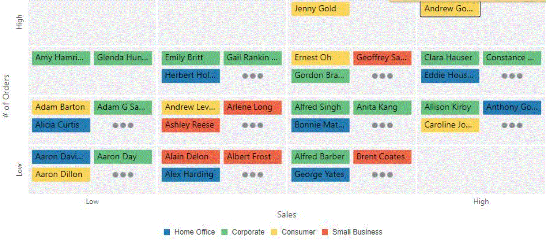
The Quadrant Visualization enables you to plot your dimension values within a quadrant based on two numeric values on the X and Y axis. One can view these metrics by an attribute.
In the example shown here, we’ve used an example sales data set and added “# of Orders” and “Sales” metrics to the Visualization. We’re viewing the data here by Customer Name and Customer Segment. The customer segment is categorized by color.
 Quadrant Visualization_QV_1")
We can hover over the small tiles in the Quadrant to see the actual metric values. For example, the customer Andrew Gonzalez has the highest number of Orders and high Sales amount to his name.
By default, the view will show limited number of values in a single Quadrant. If we click on the “Additional data” tile(three dots n each Quadrant), we will be able to see all the customers falling in that Quadrant as shown below.
 Quadrant Visualization QV 2")
 Quadrant Visualization QV 3")
More Quadrants can be added to observe more granular analysis of data.
 Quadrant Visualization _QV_5")
Have you used Quadrant Viz plugin before within Oracle Analytics Cloud (OAC) ? Let us know in the comments