The Oracle Analytics Library that Oracle provides is full of many DV extensions/visualizations that are visually rich and each of them serves different purpose based on the data being analysed. These extensions can be setup within a very short time in an OAC environment. One such visualization is Motion chart. Using this visualization, one can visualize multiple metrics over a Period of time.
We used the Motion chart to view COVID data in US. We have applied a filter to select only the Top 10 states with confirmed cases.
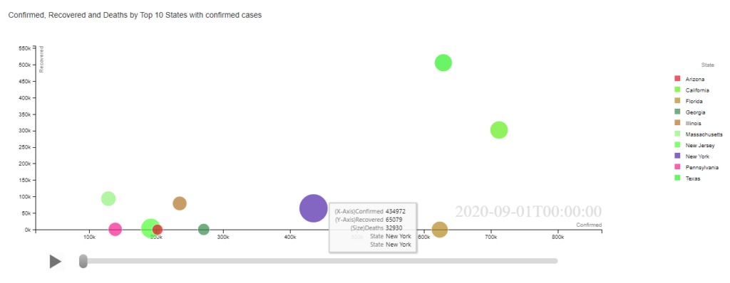
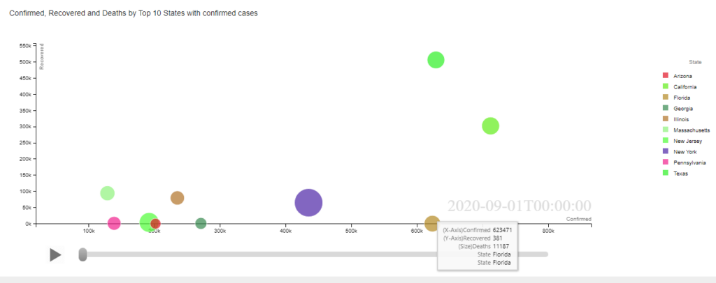
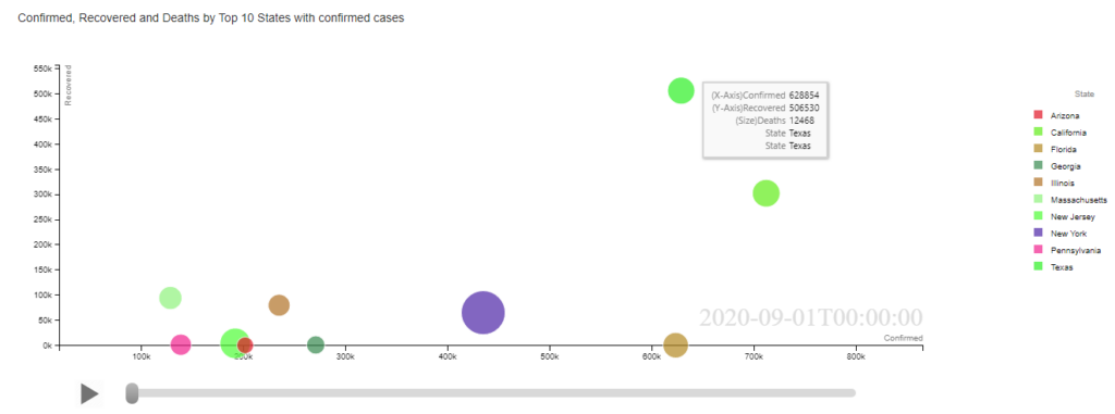
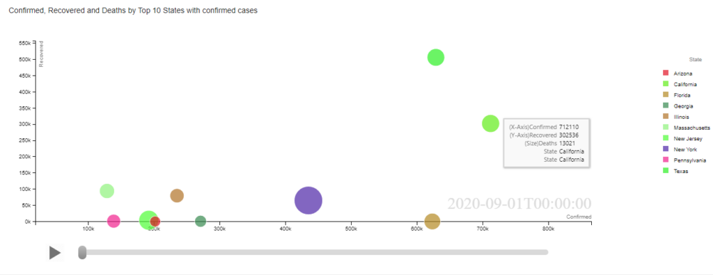
In this visualization, we are viewing confirmed cases on the X-Axis, recovered cases on the Y-Axis and the size of the circle denotes No of Deaths.
As you can see below from the screenshots taken towards the end of Period selection, New York has more deaths when compared to the number of confirmed cases by each state which suggests that the Mortality rate is high.
Whereas, in case of Florida, the recovery is very slow.
Now, if we see the states California and Texas, the recovery rate is better in Texas.
This way, we can analyse multiple KPIs at once in this visualization and can interrelate the KPIs.
Have you tried the DV extensions from Oracle Analytics Library? Let us know your comments.